Well, it sure has been a while since I last updated this website back in the far away time of... October 2022. Naturally this means I now need to go in and actually give it a refresh, especially as I am trying to make this website a little bit more than a blog that gets an article roughly semi-annually, and start exploring doing more creative writing along with deeper technical reads.
First steps first #
I did give brief contemplation to a complete overhaul of the website. I would continue to use Eleventy as it's a reasonably fast site generator, and I've already circulated through WordPress, Ghost, Jekyll, Hugo, and now Eleventy in the past and didn't want to go explore new site generators (or, gasp, go write my own).
In fact, my original plan was to go rework this entire website with the hot new stuff, Tailwind, and retire my very boring and excessively modified HTML5 UP template that was a wonderful base to work with in 2014 but downright not even worthy of a yawn in 2024. But I didn't have the luxury of time to wrap myself around Tailwind, which is a very much a fundamentally different way to view CSS. I do see the value in it, though, and I will probably adopt it for future projects (if I'm able to get that far, that is).
So I decided just to press on with updating my existing theme. To be honest, I was simply not happy with the customizations I made. There was some stuff that was just outright broken or difficult to see, and of course, the website very conspiciously lacked support for dark mode.
Tweaking the theme #
The first thing you'll notice is that there's a lot less spacing all over the place, and the header is much slimmer than it once was. I've decided to bite the bullet and adopt a widescreen view by default to improve readability and allow me to write more information-dense pages.
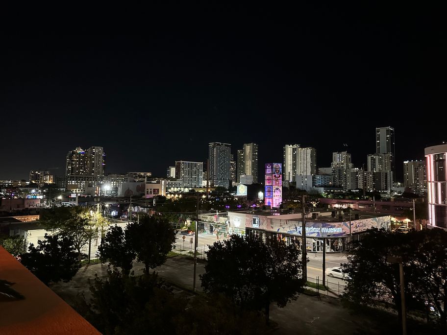
The second thing you'll notice: this website now supports dark mode. There is a nice transition from the light theme to the dark theme, and there's a button to change the theme as you please. When you do, the background will alternate: in light mode, you get the classic shot of the Brooklyn Bridge that has been there since late 2022, and in dark mode, you get a black-and-white version of the Miami skyline from Wynwood, from a work trip I took earlier this year:

The third thing you'll notice is that a lot of little tiny nits (especially with regard to responsiveness) were fixed. Finally, you'll notice that the post headers now look a lot more "normal" rather than being a giant <h1> with the date and tags underneath.
Other than that, I didn't fundamentally alter the base HTML5 UP template. It still looks largely the same, with the exception of removing a bunch of the 2014-era JavaScript that the template came bundled with (it even came with jQuery, and it is mildly amusing that jQuery is still under active development). In fact, the JavaScript I added for the theme switcher is the only JavaScript I've since added, and this site should work just fine even with JavaScript disabled (but then you're getting the light theme). I didn't even change the font: it's still the venerable Source Sans Pro (although I did look at changing it, every alternative I looked at just had a different vibe I didn't like.)
So, what's next for you? #
In the short term, I hope to have some more content here and make this blog more active than it is right now. I've got a few things kicking around: toy projects using whatever I'm interested in learning, some creative writing I've been working on intermittently (mostly short stories), potentially some stories from Ramp that aren't quite worthy of a post on our engineering blog, and some other assorted topics as they present themselves to me.
Until then, here is a 2024 re-imagination of Bertolt Brecht's 1935 poem "Questions From a Worker Who Reads", and a snippet from a story I am currently working on.
[...] Earth was a far, far cry from what it had once been. Once the cradle of human civilization, it now sat abandoned, a museum in all but name. Officially, it was called “neutral ground”, but everyone who had an interest in coming here was here to study the history of the planet or its former inhabitants. Oh, what a far cry from Wista, home to thriving metropolises and the National Research University of the Arctarian System, where she was a history professor specializing in 20th and 21st-century computing technology. Her maps indicated that she was in the vicinity of what was once Dulles International Airport, one of the airports serving what was the United States’s capital city of Washington, D.C. She immediately sized up the location. The layout of the buildings and the sprawling and curvy road network were immediately recognizable as typical of the suburban development of the United States in that time frame. In this part of the country, too, humanity built up large numbers of what were called “data centers” here. Dr. Mahone looked at her watch. The compute power it had probably dwarfed all the compute power this sad building had once hosted. How much has changed in 28 centuries! [...]